Guava
Shopping Application
Role
Creative Direction, Product Design
Scope
Develop a produce app that caters to the consumers shopping experience from home to store and eliminates the need for consumer inflicted, in-store food waste.

Background
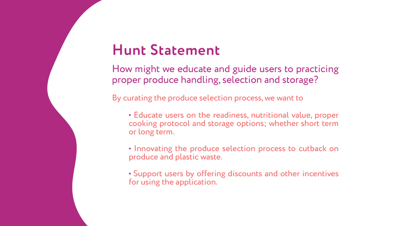
Users needed a way to utilize a produce shopping assistant that provides tailored produce selection and practices. The goal of this app is to give users a simple, accessible way to select and curate produce while also promoting healthy lifestyle choices and food waste avoidance. We posed that question: How might we educate and guide users in practicing proper fruit and vegetable handling, selection, and storage?
Given this was a group project but I’m proud to have been the creative direction for not only the branding but the product itself. The process book goes into extreme detail so it's best to have a look!
Objective
The goal of this app is to give users a simple, accessible way to select and curate produce while also promoting healthy lifestyle choices and food waste avoidance.

Creative Direction
Symbolism of Logo
Given the app is named Guava, the logo had to be a guava fruit. We wanted to focus on creating a simple, recognizable logo.
Iconology
The icons used are common and easily recognizable. Since this application is meant to be accessible, the icons should represent that. Only a few icons require context.


Solution
Camera-Based Interface
The app opens to the camera and every corner of the app can be accessed through the camera scene.
Sliding Scales and Tags
The flavor and texture of produce are important. Creating a tag or sliding scale system allows for transparency.
Simple Onboarding
Rather than onboarding being complicated and a deal, the app will speak for itself. Minimal time spent learning about guava and maximizing time spent experiencing guava.
Speech-Enabled
This feature can be utilized for the visually impaired as a means to pick produce without constantly touching.


